IDENTITY EXTENSION OF ORIGINAL LOGO AND MASCOT FLAVOR SYSTEM BY JELLYSHOT AGENCY
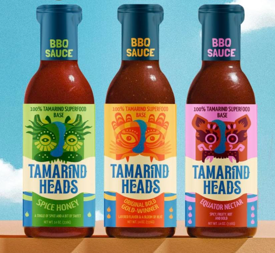
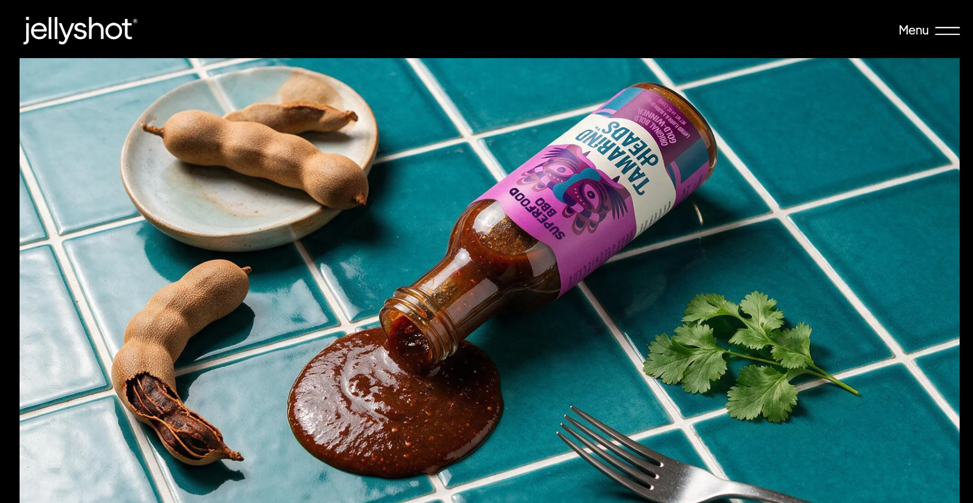
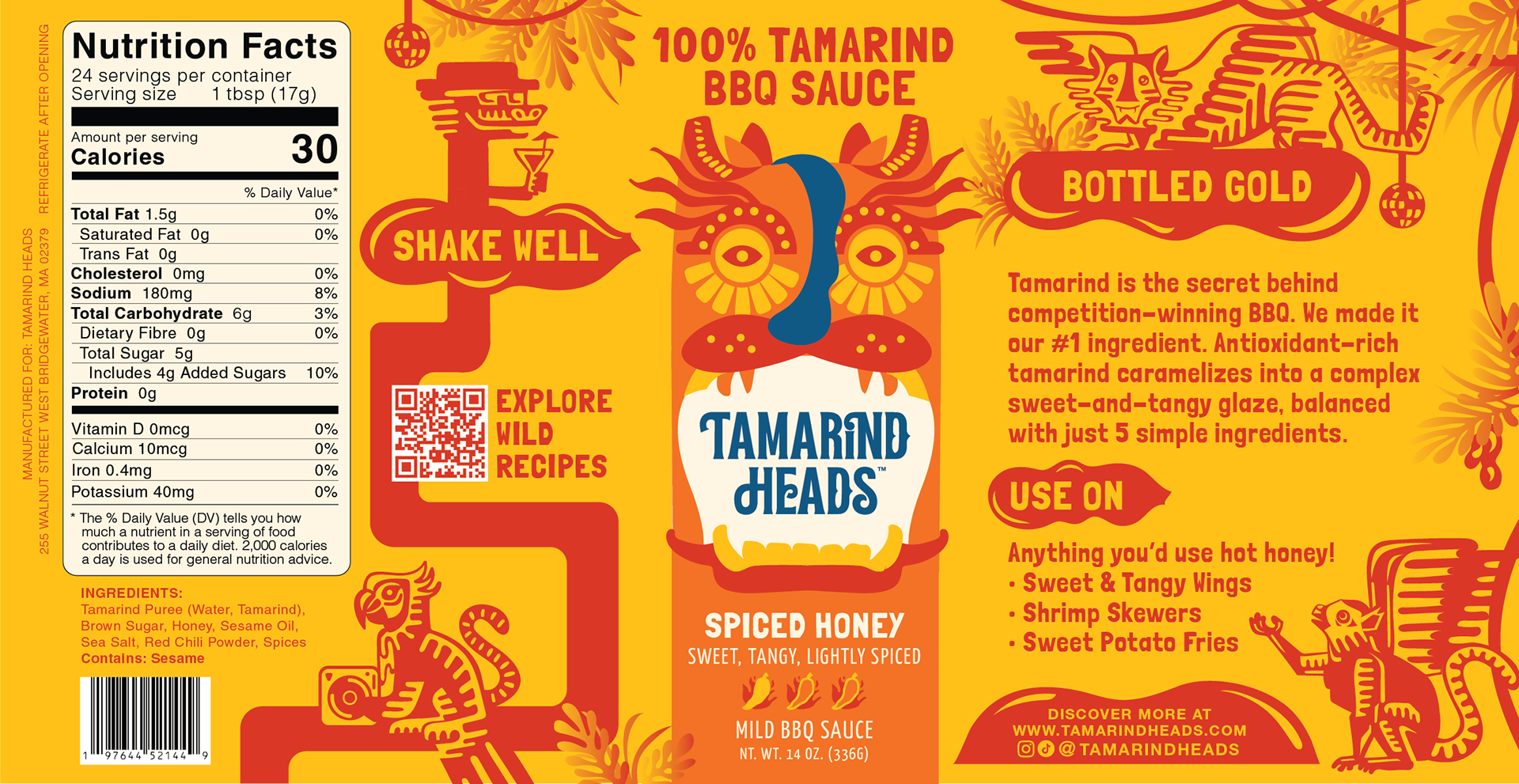
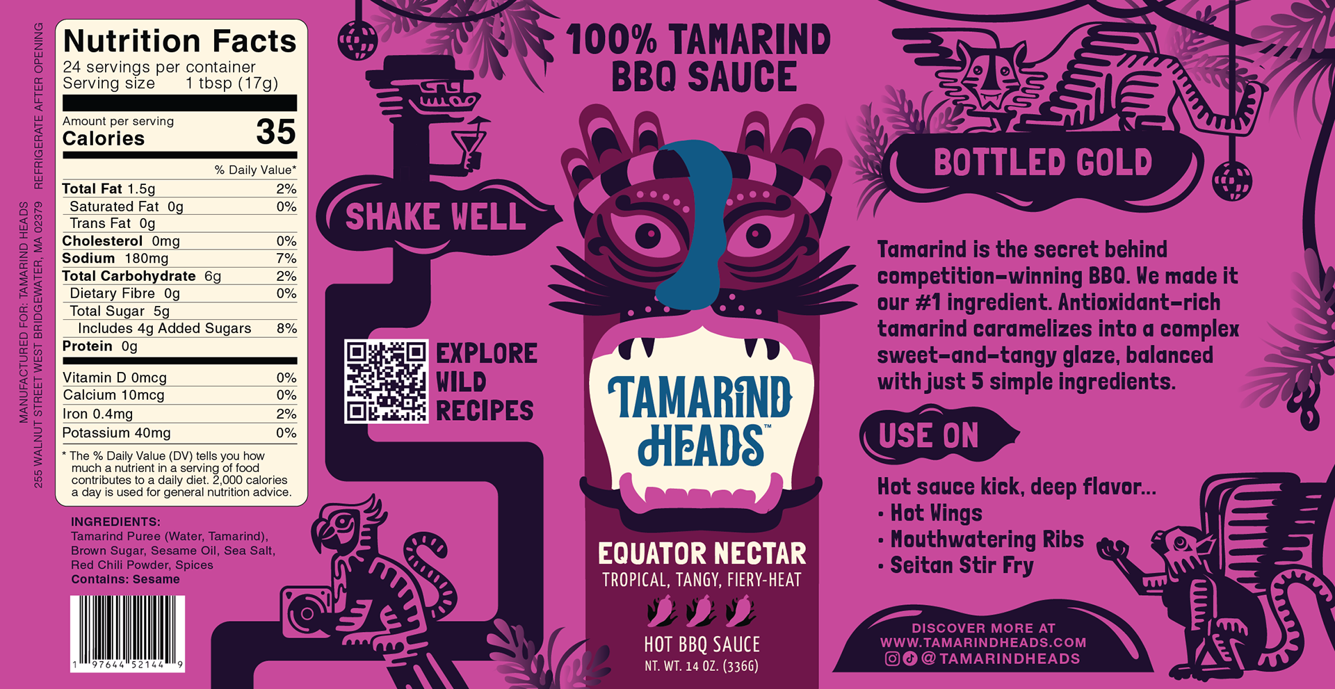
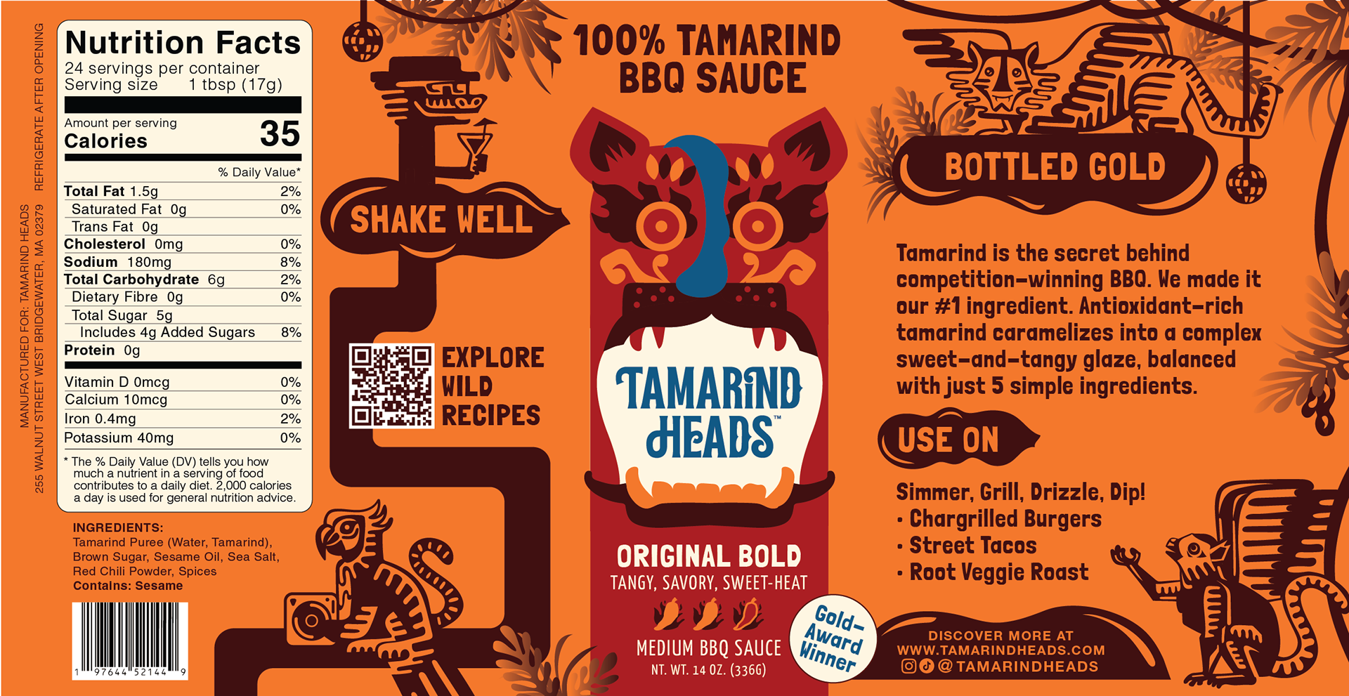
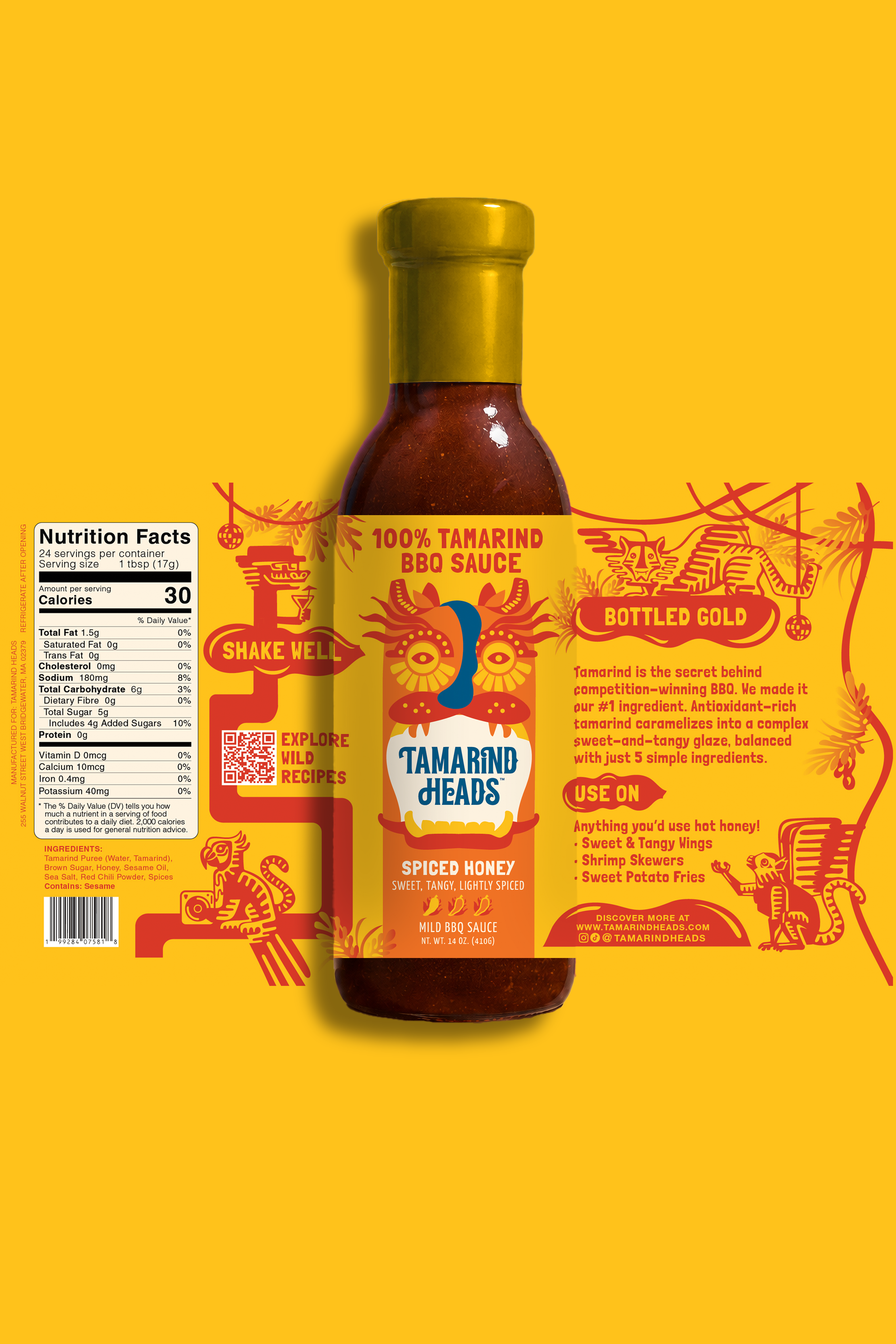
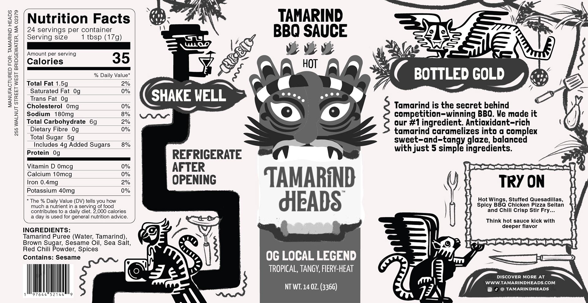
Tamarind Heads is an American barbeque sauce brand bringing the equatorial classic tamarind flavor to the USA market. Based in New York and a member of Specialty Food Associate, Brittney and Sashi approached me before their Fancy Food 2026 trade showcase to extend their rebranded logo and flavor mascot system into an illustrated brand world and develop the FDA compliant information design for their bottle labels.
•
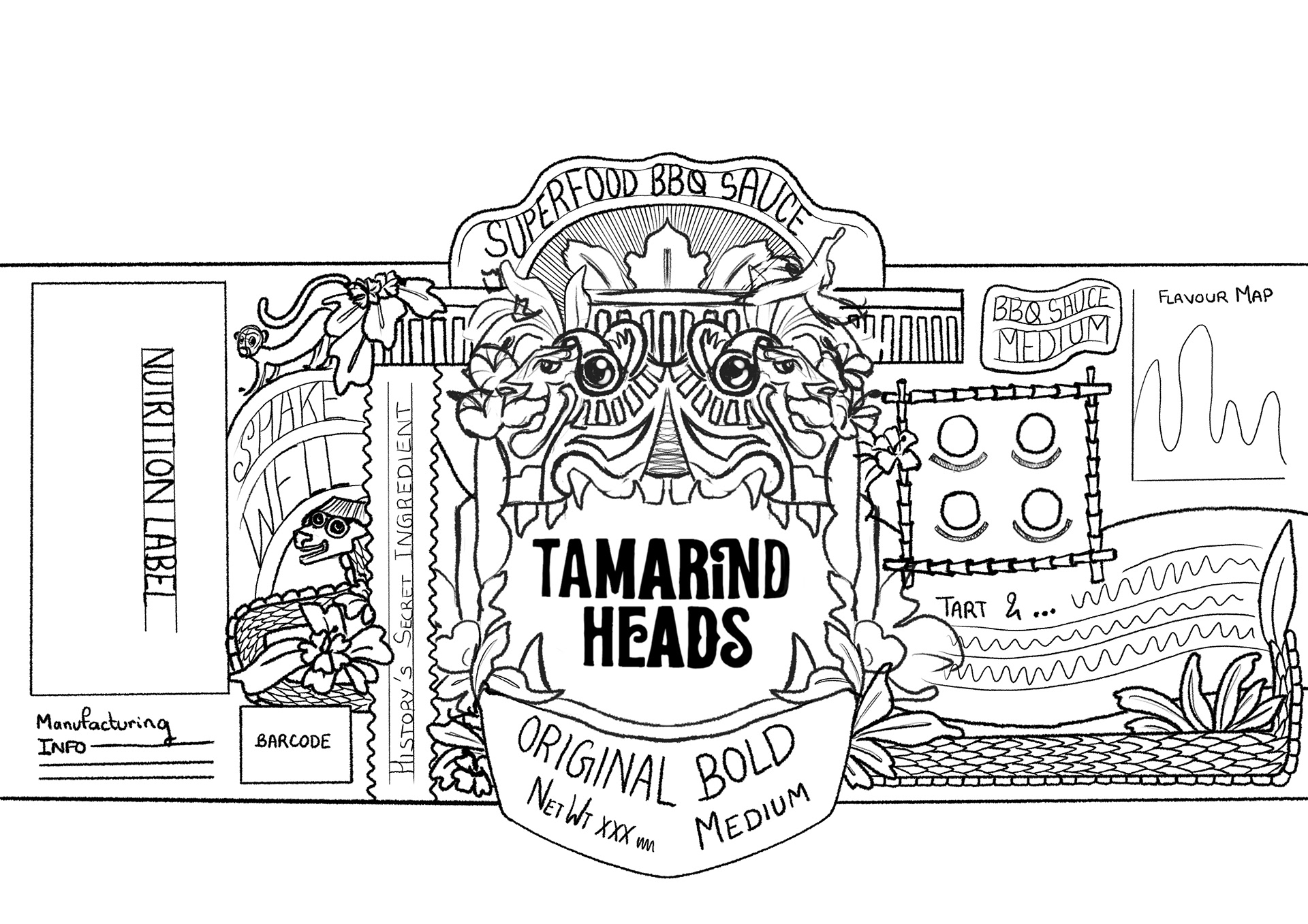
The idea was to lean into the equatorial forest inspiration of the brand's origins and we a developed chimeric character system to bring about a groovy and celebratory brand personality.
•
The idea was to lean into the equatorial forest inspiration of the brand's origins and we a developed chimeric character system to bring about a groovy and celebratory brand personality.
PRIMARY BUSINESS GOALS
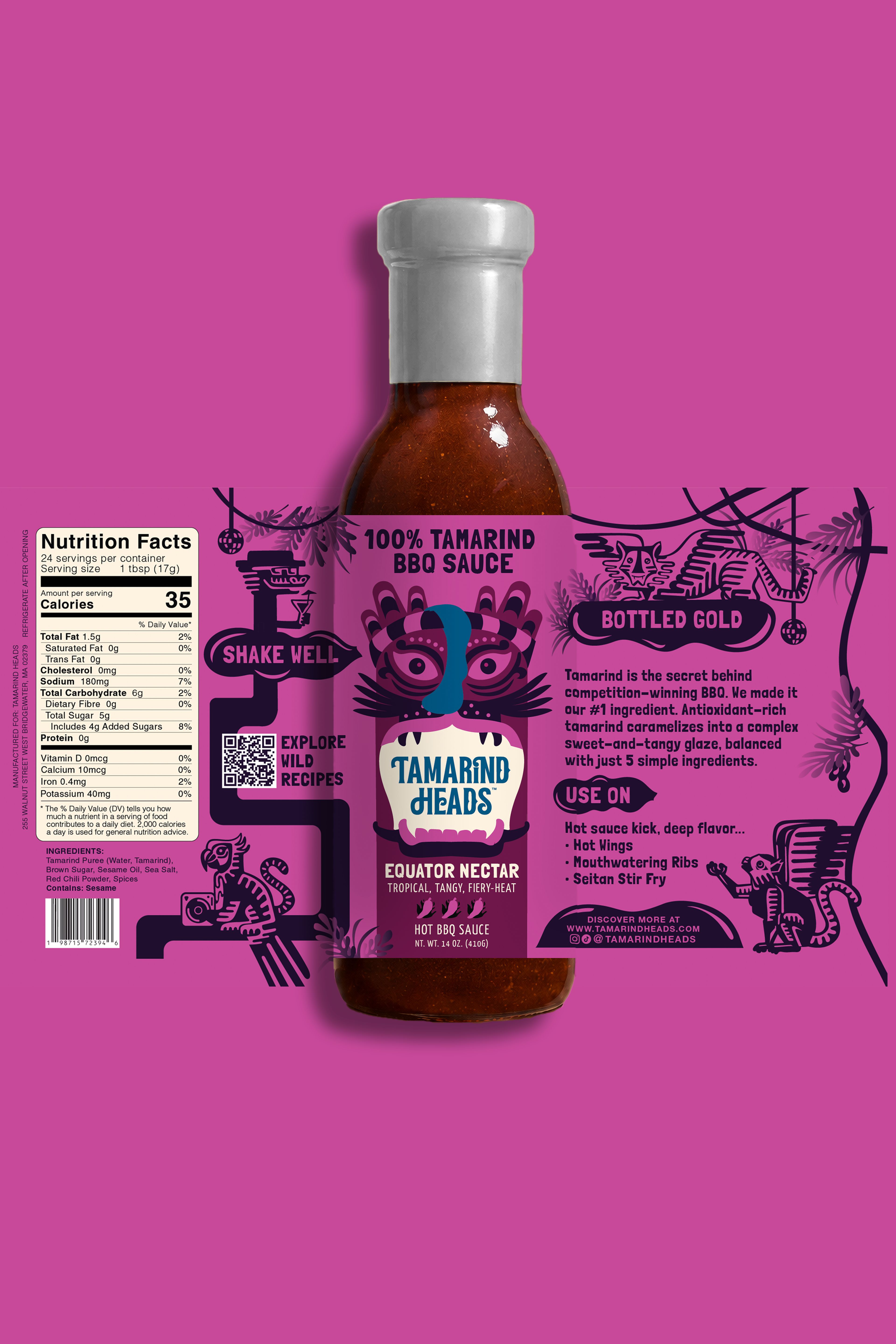
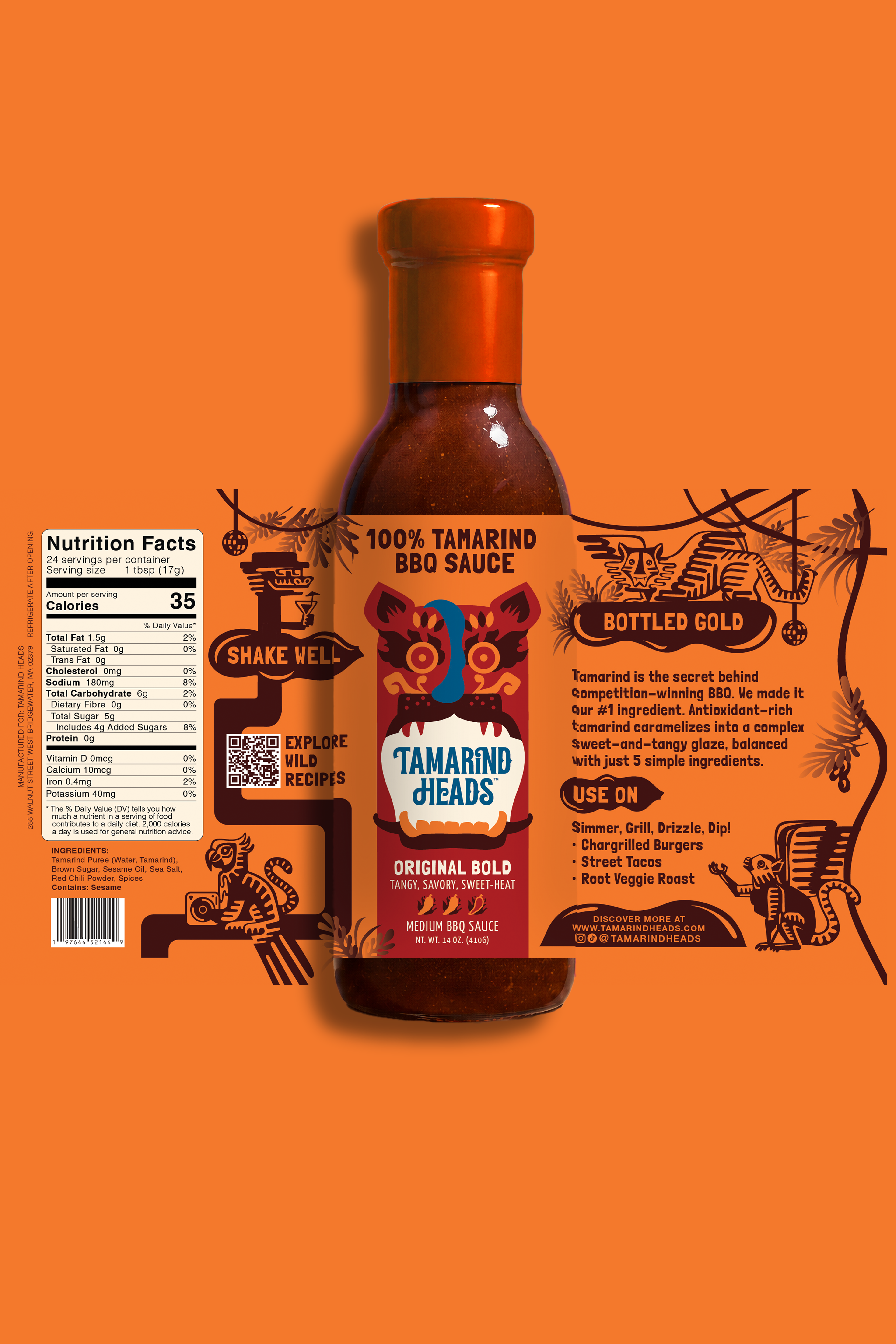
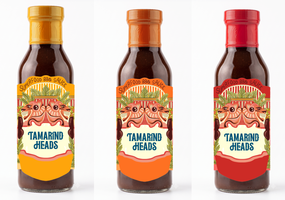
To stand out on hot sauce and barbeque sauce retail shelves by using bold colours and create a brand world represents the origin story of the name 'Tamarind Heads'. To extend existing brand mascots and logo into an illustrated system that can serve as a basis for branding and packaging for future SKUs as well as brand merchandise.
TARGET MARKET CONSTRAINTS
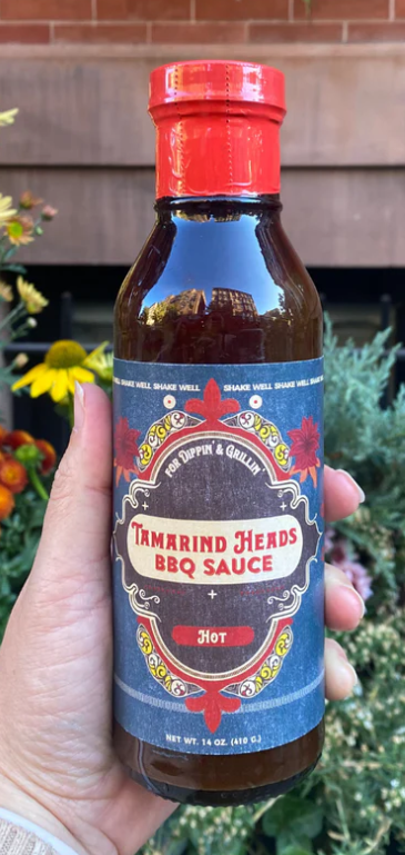
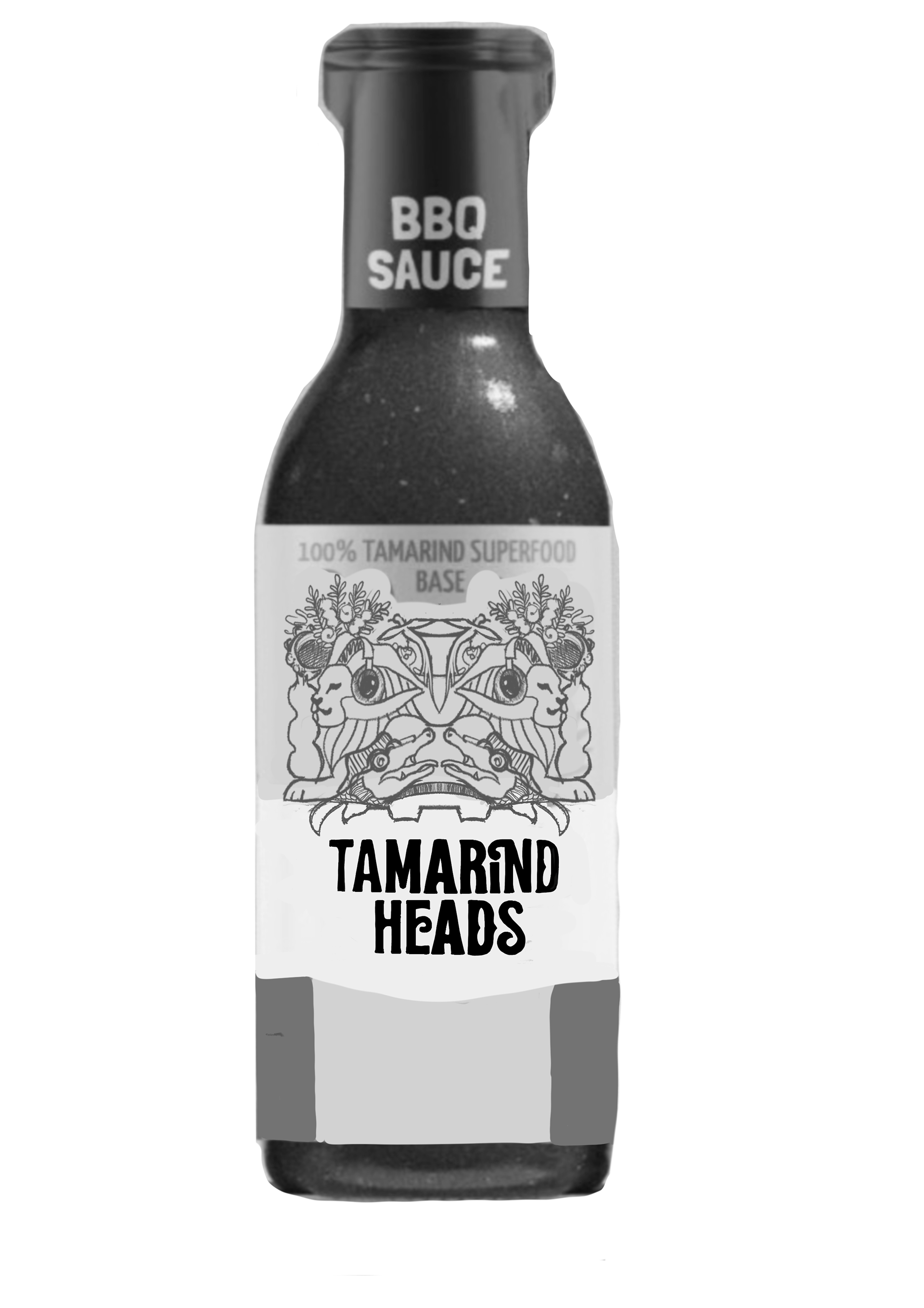
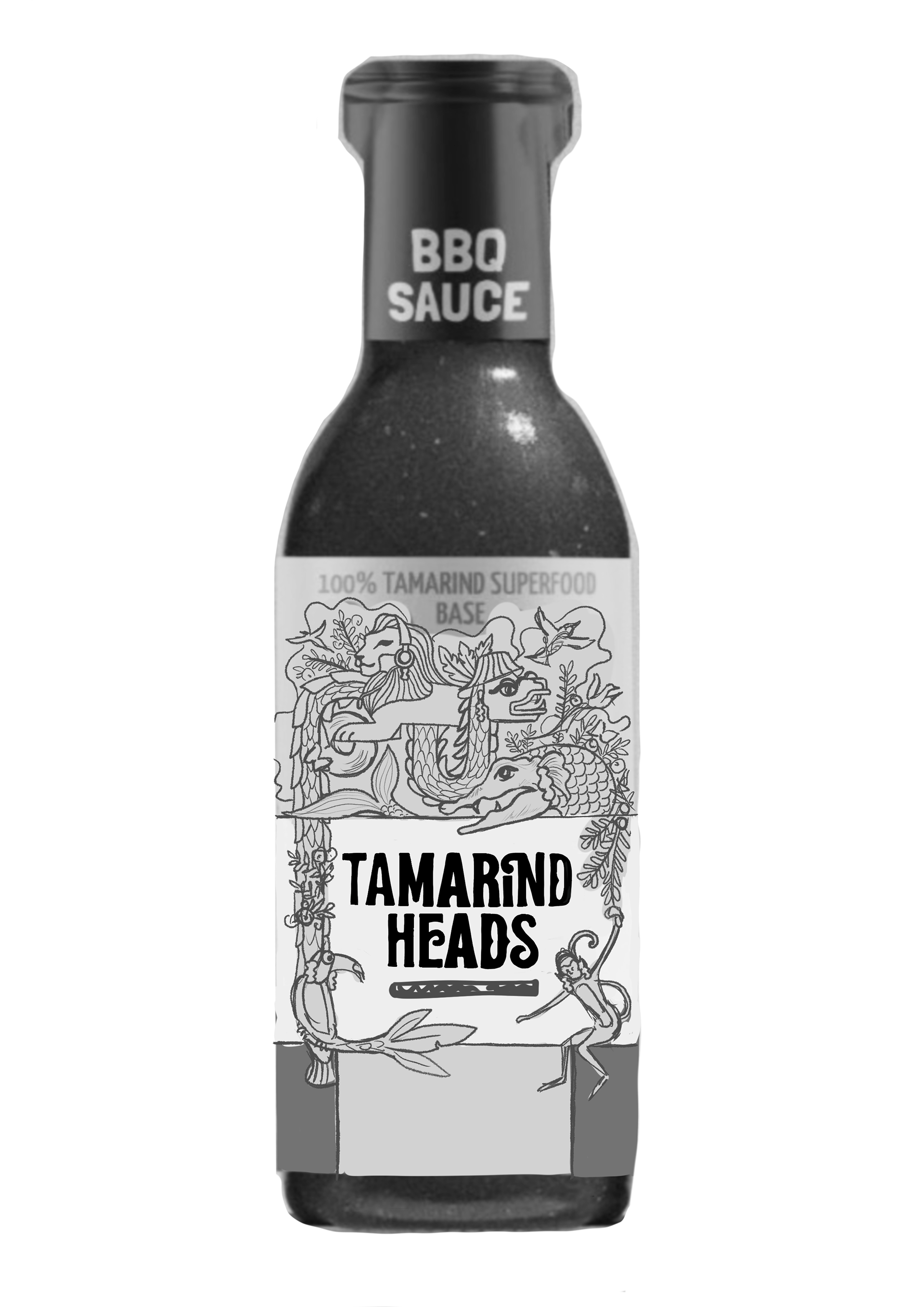
BBQ and hot sauce branding heavily relies on relish and appetite inducing imagery. While creating an illustrated world, we had to ensure that we do not lose the essence of appetite by primarily focusing on the 'The Bite'. This idea by founders Brittney and Sashi was supposed to be at the centre of focus and rest of the information design and brand world had to integrate the main mascot system designed by JellyShot agency.
STRATEGIC DIRECTION
I focused on developing a brand world of a chimeric equatorial forest bonanza where mythical creatures come together in a groovy and whimsical forest. This direction is designed to be extended further into motion graphics, brand merchandise and new SKUs are the brand grows and expands. We also integrated tamarind-shaped information bubbles that make the information and art on the label read as a whole rather than a sum of its parts.